Unifying a brand to help engage kids in a quality learning experience.
As of June 11, 2012, there were approximately 650,000 apps in the App Store according to Apple CEO Tim Cook. That number is likely to increase as developers create new applications for iOS devices. As this mountain of apps grows larger, developers are being challenged to make their apps stand out from the crowd to reach the maximum number of potential customers. This is a new arena for an old problem, and we are excited to help the Mobile Education Store climb to the top of the mountain.
The apps developed by the Mobile Education Store are designed to meet some very specific gaps in the education market. They discovered, through personal experience, that educational software for special needs students was expensive, limited, and ultimately ineffective. They also found that the applications lacked the critical feature of engaging students and making them actually want to play and learn. Realizing that the only way they were going to get what they needed was to create it themselves, the Mobile Education Store got to work and created a suite of iOS apps — each designed to address a specific language-related challenge for special needs students. Reviews of the apps were overwhelmingly positive, so the next challenge became spreading the word.
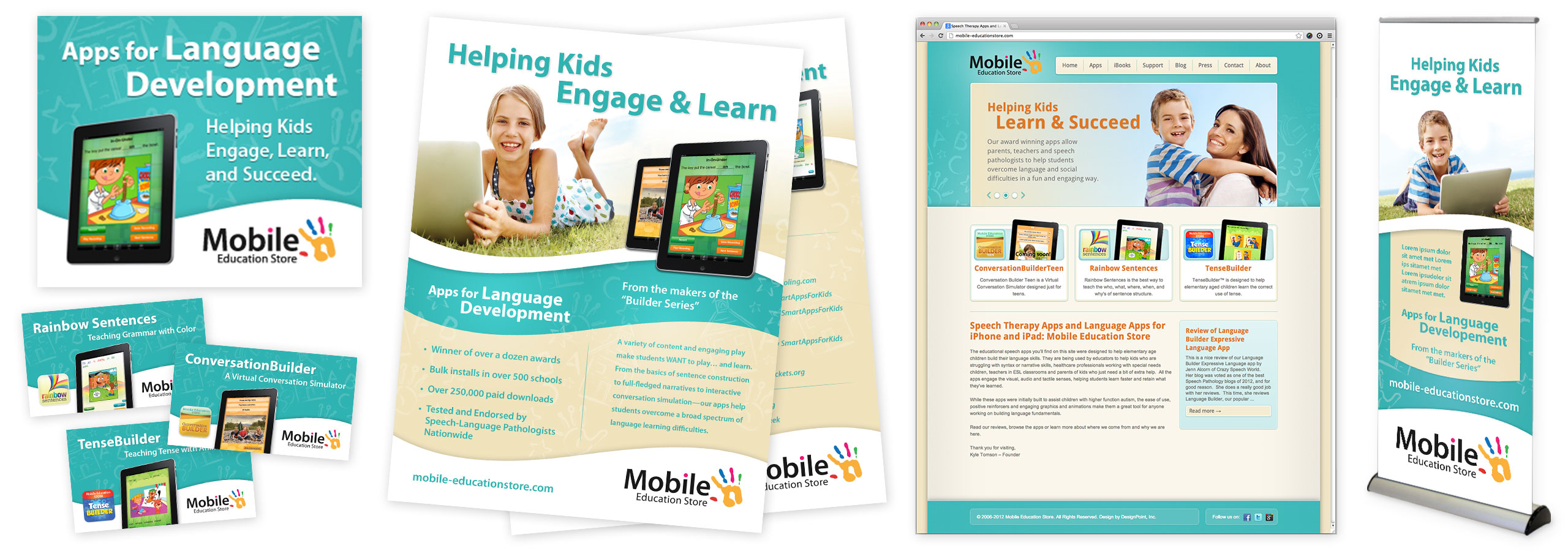
Recognizing the need to reach customers outside of the App Store, Mobile Education Store had already invested in a logo and website, but they did not feel like the website was visually appealing enough to encourage people to find out more and download their software. They knew that they needed to provide a professional and attractive experience for site visitors to better reflect the same qualities they had worked so hard to incorporate into their apps. After meeting with them and getting a look at their applications, we rebranded their website and worked with our developer to ensure that the content and features of their site would drive traffic quickly and easily to their online catalog — and ultimately to the App Store to finalize purchases. The fact that the final transactions would be completed on the App Store made the development of the Mobile Education Store’s website quite a bit easier because shopping carts, secure servers, and merchant accounts would not be necessary.
A big part of Mobile Education Store’s strategy for increasing awareness of their software is to attend tradeshows and to talk with educators and parents directly whenever possible. To help make a lasting impression in those meetings and elsewhere, we have furnished the Mobile Education Store with attractive roll-up banners, flyers, and business cards. We also recently designed some app-specific cards to help promote the website and allow for quick access via mobile devices. These app cards are business card size, contain information about a specific app, and include a QR code that takes a smartphone user directly to the app’s review page.
The Mobile Education Store is not out of ideas yet. They continue to develop new and innovative apps which help schools utilize emerging technology and reach students in ways that keep them interested and engaged. We are looking forward to partnering with them as they continue to innovate in the realm of educational software.
Here’s a sampling of Mobile Education Store’s current advertising materials…

“I can’t say enough great things about DesignPoint. Not only is their work top-notch, but they always meet my schedule — even when I throw them things at the last minute. I consider them on of my top contractors.”
— Kyle Tomson, Founder, Mobile Education Store

