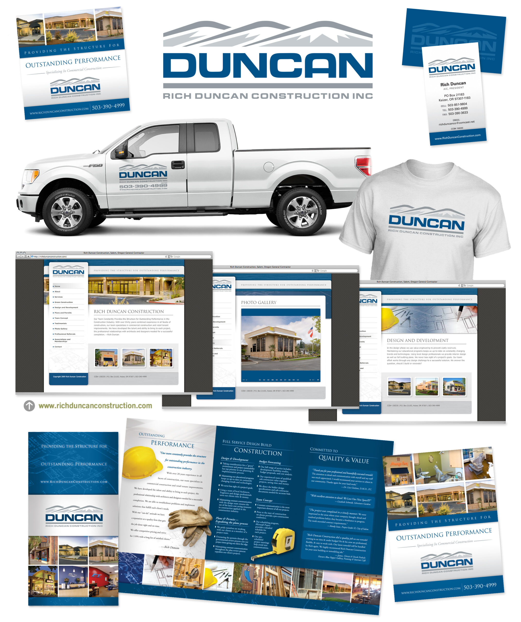
Carefully redesigning the visual foundation of Rich Duncan Construction.
Changing the name and brand image of your company is a course of action that should not be taken lightly. The benefit of a different name is that it can increase business by appealing to a wider audience. The risk for companies that have been in business as long as Rich Duncan Construction is the possibility of losing current customers if they’re unable to recognize the new name and branding materials.
Rich Duncan Construction is much more than a one-man operation, so they wanted to adjust their identity to better reflect the scope of their abilities. After considering several options for a new company name they decided that “Duncan Construction” would continue to be familiar to their existing customers and would also help convey the fact that they’re a much larger company than the original name implied.
Our job was to integrate the new company name with a new identity that had a modern feel but didn’t become unrecognizable to their existing customers. We decided to focus on the original elements of the identity and modernize each one while keeping the same overall structure of the identity.
The primary visual element of the new logo is the mountains. These existed in the previous logo, but were much more abstract, and were often mistaken for rooftops. Our solution was to enlarge them and add more detail to better communicate what they represent. The color palette was adjusted slightly to introduce a truer blue. We also changed the font from a hand-scripted serif font to a cleaner, bolder, more modern typeface to suit the new style. The new logo is sturdy and rigid in construction, indicating strength and reliability. Finally, we removed the wide blue bar and replaced it with a more subtle gray bar that doesn’t draw as much attention away from the name.
Rather than abandoning the old name altogether, the decision was made to keep “Rich Duncan Construction Inc.” as the tagline. This goes a long way to eliminate any confusion for Duncan Construction’s existing client base and serves as a transitional element. Eventually, as Duncan Construction becomes more recognized by their new name, the tagline can be removed or revised without harming the integrity of the overall logo.
Once the logo was finalized we moved on to the rest of their marketing materials. Business cards, brochures, and the website had to be brought up to date. The resulting materials reassure previous customers that this is the same company they’ve grown to trust and present a brand identity to new clients that inspires confidence in the capabilities of a very experienced team at Duncan Construction…
A sampling of new materials created for Rich Duncan Construction…
“In today’s tough economic time our company faced the challenge of expanding our market in an effort to keep the doors open. We chose to put our trust in DesignPoint as our point marketing company. They offered a controlled, well-balanced plan to update our image and not reinvent the wheel. This saved us time and money! We believe the ideas and marketing plan executed with DesignPoint were well worth the investment.”
— Rich Duncan, President


