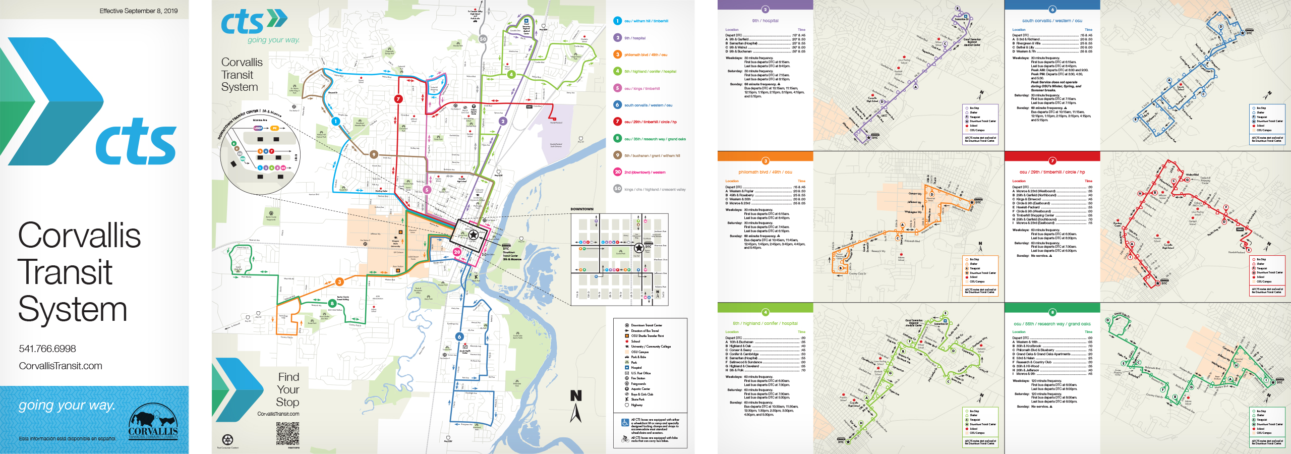
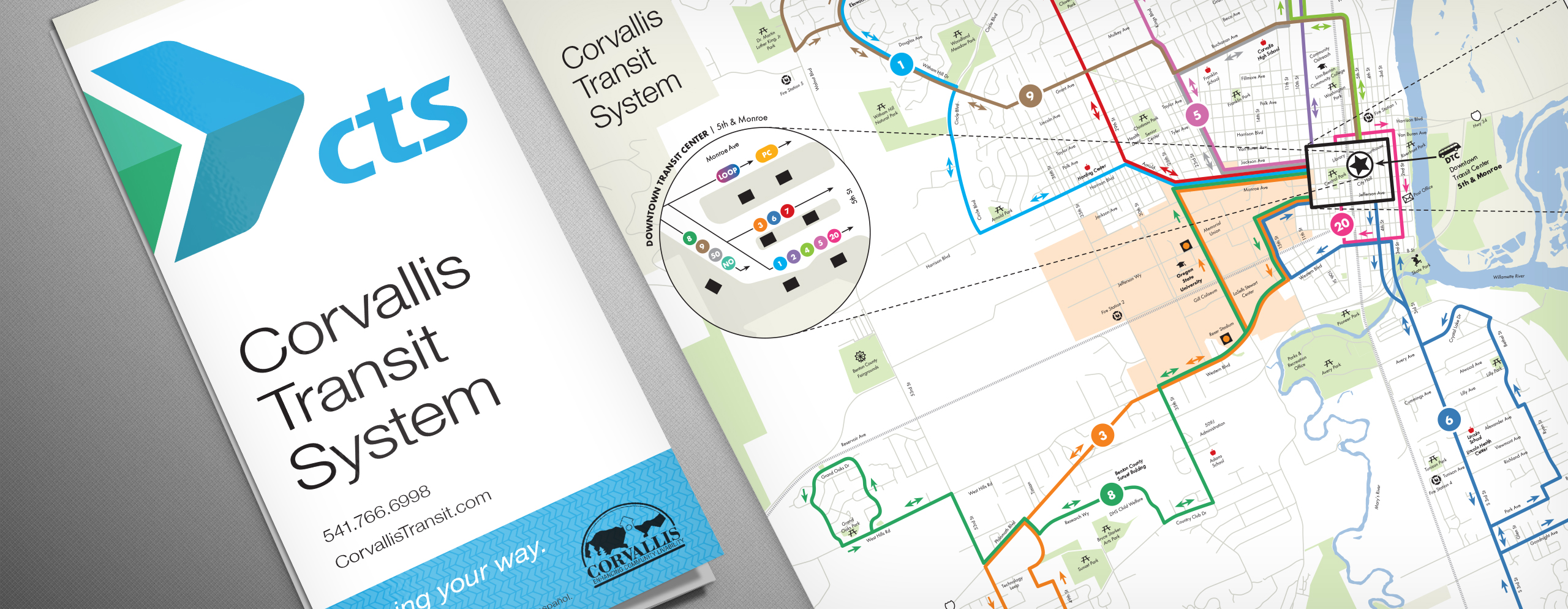
We recently got a little cartography under our belts when we assisted Corvallis Transit System with an update to their bus route map.
The two goals for this project were to accurately represent the upcoming changes to the existing Corvallis Transit System (CTS) bus routes and to implement their new identity.
CTS recently redesigned their logo, but they had yet to apply it to their materials. We were able to use the cover of the folded map to take their new logo and begin to establish an overall identity for their materials moving forward. The design is clean and modern, in keeping with the elegant and efficient look of their updated brand.
Updating the individual route maps was done in Adobe Illustrator and required painstaking detail and careful review to make sure the indicated path properly matched and clearly communicated the new routes. Fortunately, we didn’t have to start from scratch, as the previous build files were available, but it did require more than one conversation with CTS to make sure we properly understood the changes — especially in the cases where routes would change direction at different times during the day.
This was a unique project that provided us with some interesting challenges. It serves as a great example of how we can work with your existing materials to expand and update your identity.


